
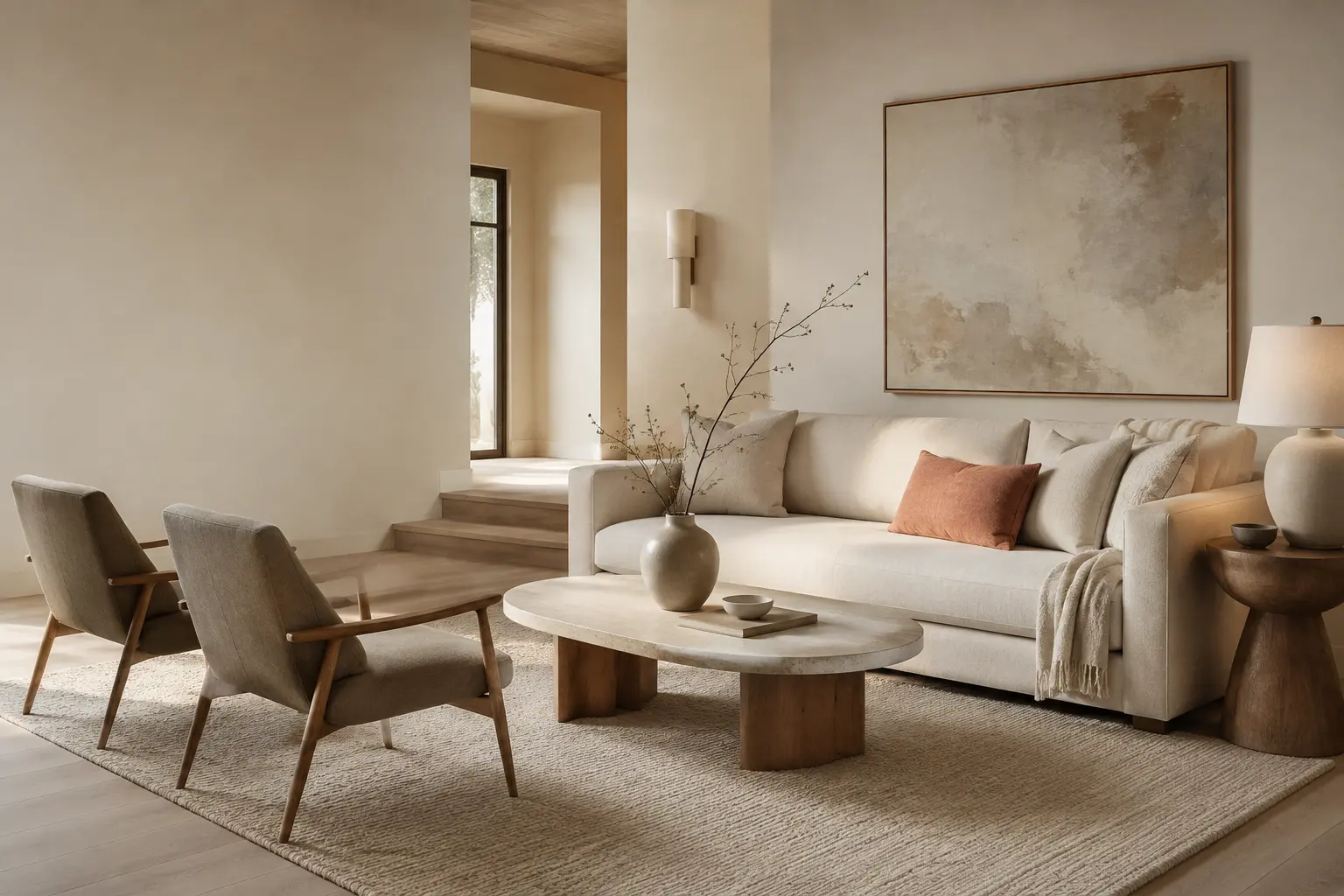
Use this simple method to narrow your options and choose with greater confidence.
1. Start with the feeling you want to create
Before comparing shades, decide how the room should feel. Do you want it to feel soft and restful, light and airy, or grounded and enveloping?
- Warm ivory and cream create a light, gentle atmosphere.
- Soft beige and sand add comfort and natural warmth.
- Warm greige and taupe feel more grounded and tailored.
This first decision helps you avoid choosing a color simply because it looks beautiful in someone else’s home.
2. Read the undertone—not only the color name
Two shades called “beige” can look completely different once they are on the wall. Look beneath the main color for a subtle yellow, peach, pink, green or gray influence.
For a balanced NHD look, compare the paint with the room’s permanent finishes: flooring, stone, cabinetry, tile and large furniture. A warm neutral should relate to those materials without matching every surface exactly.
3. Observe the room’s natural light
The same paint can shift throughout the day.
- North-facing or shaded rooms often benefit from a warmer, softer neutral.
- Bright south- or west-facing rooms may make creamy shades appear more golden.
- Artificial lighting can strengthen yellow or gray undertones at night.
Review your samples in morning light, afternoon light and after sunset. The best choice should feel comfortable across the times when you use the room most.
4. Let the fixed materials guide the palette
Begin with the elements that are difficult or expensive to replace. If the floor has honey or golden tones, an extremely cool gray may feel disconnected. If the stone or tile has a quiet taupe undertone, a soft greige may create a more cohesive transition.
Think of the paint as the background that brings the materials together. It should support the room—not compete with it.
5. Test a large sample before committing
A small paint chip cannot show how a color will behave across a full wall. Paint a movable sample board or use a large removable swatch, then place it on more than one wall.
Keep each sample visible for at least two full days. Compare no more than three strong options at one time so the differences remain easy to read.
The NHD Warm Neutral Check
- Does the undertone work with the flooring and largest furnishings?
- Does the shade still feel right in morning and evening light?
- Does it create the mood I want for this room?
- Does it connect comfortably with the adjoining spaces?
- Have I tested it on more than one wall?
If the answer is yes across all five questions, you are much closer to a neutral that will feel intentional—not accidental.